After understanding what CRI (Color Rendering Index) means, you might find another similar concept confusing—color temperature. To put it simply, we can make a comparison between it and CRI. While CRI reflects how well the light source displays the actual colors of the lit object, color temperature is the color of the light it emits. Even though most lights may appear to produce white light, subtle distinctions exist within the realm of white. That is why it is useful when describing the light. In the following discussion, we’ll delve deeper into color temperature and how to select the right one for your space. So, keep reading!
What Is Color Temperature in Lighting?
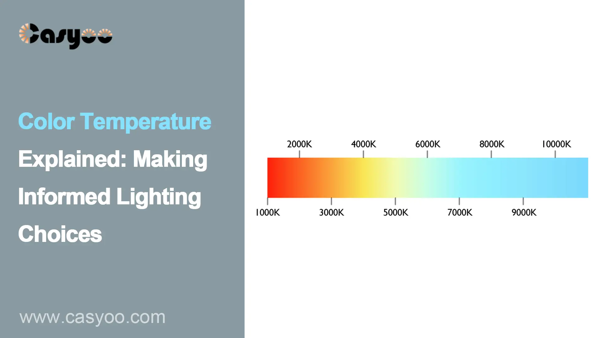
Color temperature research in lighting originates from blackbody radiation investigations. The theoretical blackbody produces light emissions that change with temperature according to research extensively conducted in the 19th century by scientists Max Planck and Josef Stefan. Through their discoveries scientists introduced the Kelvin (K) scale used for measuring color temperature to represent the hues that come out from blackbody radiators at different temperatures. The blackbody transitions through color stages that start with red before advancing to orange followed by yellow through white until it reaches blue as its temperature increases. The Kelvin (K) scale provides a measurement system for absolute temperature which begins at absolute zero (-273.15°C) to quantify this color progression. The following chart shows different Kelvin and its corresponding color.
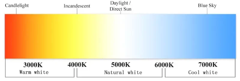
Classification of Color Temperature
The continuous color changes of a black body can be categorized into distinct stages, with yellow, white, and blue serving as the three representative colors. Light color temperature can be classified into three groups according to these stages:
Warm white (2700K-3000K)
2700K-3000K presents a cozy, yellowish light that is similar to that of traditional incandescent lamps. It’s perfect for bedrooms and living rooms, creating a warm and inviting ambiance.
Natural white (3500K-4000K)
Falling between warm and cool white, natural white suits general lighting needs. You can use it in offices or corridors for balanced illumination.
Cool white (5000K-6500K)
This type of light is crisper and bluer. It can fit those settings that require heightened alertness and productivity, such as business or industrial areas.
Why Does Color Temperature Matter?
When considering the effect of lighting, it can be very significant. Different settings call for different color temperatures to match their purposes. Warm white lighting promotes relaxation and a homely atmosphere. Conversely, cool white lighting enhances concentration, making it ideal for tasks like reading, drawing, or cooking.
What’s more, it can also affect the body’s biological rhythms. High color temperatures make people more alert during the day, while low color temperatures help them relax and fall asleep at night.
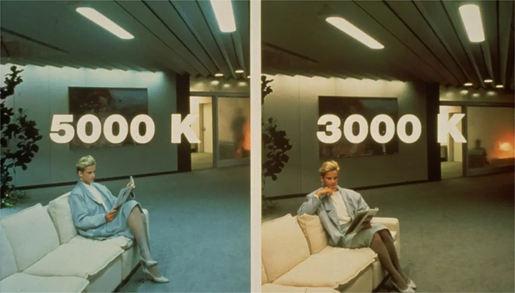
Color Temperature of Different Light Sources
Light sources possess significantly different color temperatures which affect how warm or cool they seem to the human eye.
- Incandescent lights: 2700-2900K, yellow-orange tint light
- Fluorescent lamps: 3000-6500K, warm-white or cool-white light
- LED lamps: 2700-6500K adjustable, warm-white or daylight-like light
- High-pressure sodium lamps: Below 2000 K, yellow light
How do I Choose the Color Temperature?
One of the easiest ways is to refer to the common choices for different settings.
- Residential areas: You can apply lights with low color temperatures ranging from 2700K to 3000K at places like bedrooms, living rooms, and other rest areas to make the atmosphere more relaxing. In areas like kitchens and bathrooms, it can be a little higher, between 3000K and 4000K, to provide clearer light.
- Offices and study areas: A color temperature between 4000K and 5000K works well in these spaces as it enhances alertness, focus, and productivity.
- Commercial and retail areas: Commercial and retail spaces benefit from natural or cool white lighting, ranging from 3500K to 5000K, to create a bright environment that accurately displays merchandise colors.
- Outdoor lighting: Which outdoor lighting option is best depends on the specific requirements. For security lighting, you can choose 5000K; for landscape lighting, the warm white is more helpful to create a special atmosphere. Casyoo provides various decorative lights with a suitable color temperature to beautify your space.
Here are some more considerations:
- Decorative style: Warm white lighting complements traditional and cozy decor styles, while cool white lighting suits modern and fresh aesthetics.
- Consistency: While choosing the color temperature for adjacent areas, be aware that it should be similar to prevent conflicting lighting effects and visual fatigue.
- Personal preference: Some people prefer warm white light, while others lean toward cool white. For more pleasing illumination, select the one that suits your preferences.
What’s Trending: Adjustable Color Temperature LED
Through LED technology developers can now achieve precise spectrum output management that leads to better temperature regulation and stability. LED technology provides users with precise control to adjust color temperatures from warming 2700 K to cool 6500 K white light therefore delivering reliable performance in all applications. The modern phosphor coatings and semiconductor materials are the key to achieve this precise adjustment.
Besides, the ability of intelligent lighting systems to modify color temperature through LED technology remains based on user needs and environmental requirements. LED-based smart systems duplicate daylight processes by moving between morning cool and evening warm light tones thus supporting body clock regulation and enhancing user comfort. LEDs become usable in smart automation systems because of their digital controls and spectral tuning functionalities.
Conclusions
The color temperature of LEDs can be classified into warm white, natural white, and cool white, each suited to different applications. Make sure you choose the right one to harmonize your lighting with your space so that the lighting won’t be abrupt or inappropriate. You can make your selection based on recommendations for common lighting scenarios and consider other factors like consistency. If needed, don’t hesitate to reach out to us for professional guidance in choosing the perfect color temperature!
Frequently Asked Questions
- Is 3000K color temperature warm or cool?
3000K is considered standard warm light. This color works best in bedrooms together with living rooms and comparable rooms since it builds relaxing warmth suitable for relaxation.
- What is brighter, 3000K or 5000K?
The actual brightness level remains unaffected by color temperature but visual perception shows higher colors usually look brighter than lower colors. Therefore, light at 5000K will seem slightly brighter than light at 3000K, despite having the same luminous intensity.
- What does color temperature 4000K mean?
4000K represents a hue between white and warm white. The color temperature provides versatility to work in diverse settings due to its balanced nature.
Related reading: